Redzone

Crafting a compelling brand platform for market leadership

OVERVIEW

For mid to large food, beverage, and CPG manufacturers, Redzone is the champion of the frontline worker, with a surprisingly simple and remarkably powerful solution to empower, engage, and energize the frontline. Since 2014, the company has been refining its platform, balancing its growth and impact, and fervently standing behind its unique people-centric mission. With a renewed commitment to increasing awareness, growing market leadership, and targeting enterprise leaders, Redzone engaged Sustena to lead the charge in developing a compelling, new brand platform.

Private Equity

  • Private Equity Backed

Sector

  • Computer Software

Deliverables

  • Positioning & Messaging
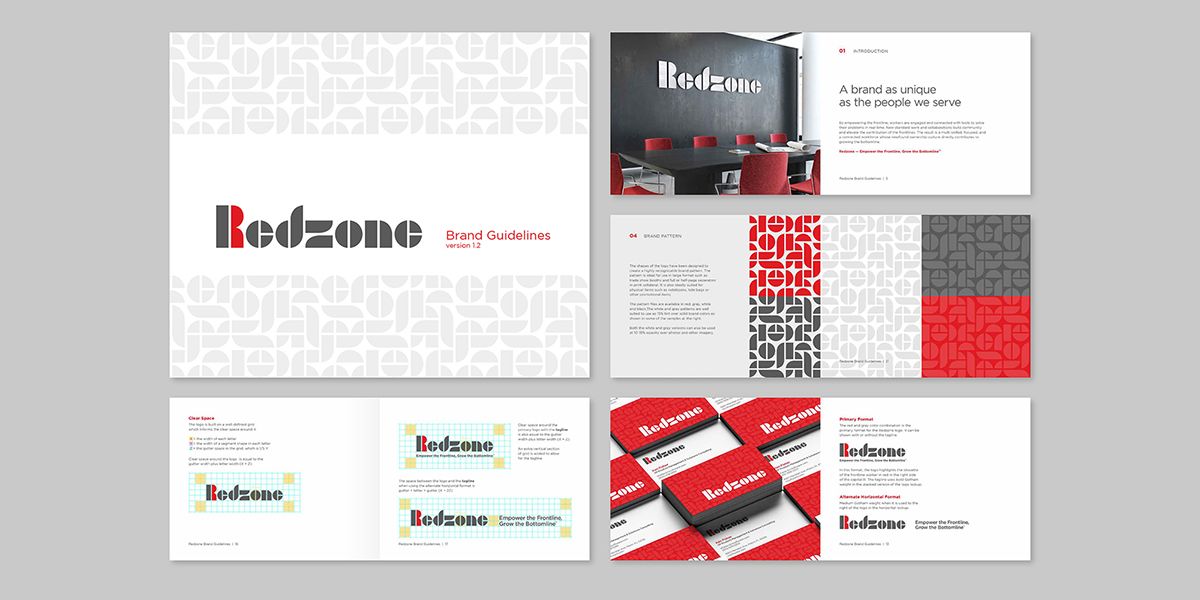
  • Visual Brand Development
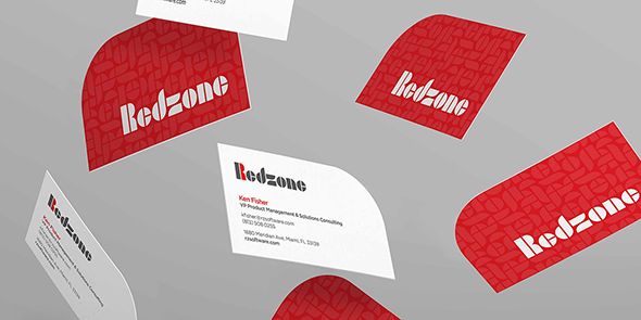
  • Branded Business Tools
  • Targeted Message Training
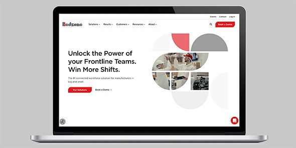
  • Website Development
  • Brand Launch Video
  • Iconography Library
  • Animated Graphics
Redzone
The Redzone logo was designed with teamwork in mind. Each letter is composed of geometric shapes that stand alongside one another to tell a story.

Since we launched the new Redzone brand in March of 2022 we have seen measurable success across key KPIs. By harnessing the power of the connected worker, we’ve noted a 60% jump in website traffic, an uplift in press pickups, and an impressive increase in new enterprise business. This rebrand has provided us with the momentum to meet many of our 2022 goals well ahead of schedule.

Claudine Bianchi

SVP Global Marketing

01

PROBLEM

Due to a changing landscape and newly emerging competitors, Redzone needed to differentiate itself from other workforce solutions.

SOLUTION

We developed an updated message platform to speak to Redzone’s core strengths and key points of differentiation. 

02

PROBLEM

New clients had a limited awareness of their solution, and their messaging was unclear and complex.

SOLUTION

Our foundational brand strategy efforts, website, and sales and marketing infrastructure aimed to educate clients on Redzone’s core offerings.

03

PROBLEM

Their visual branding needed an update to reflect their human-focused approach.

SOLUTION

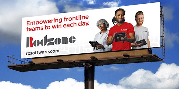
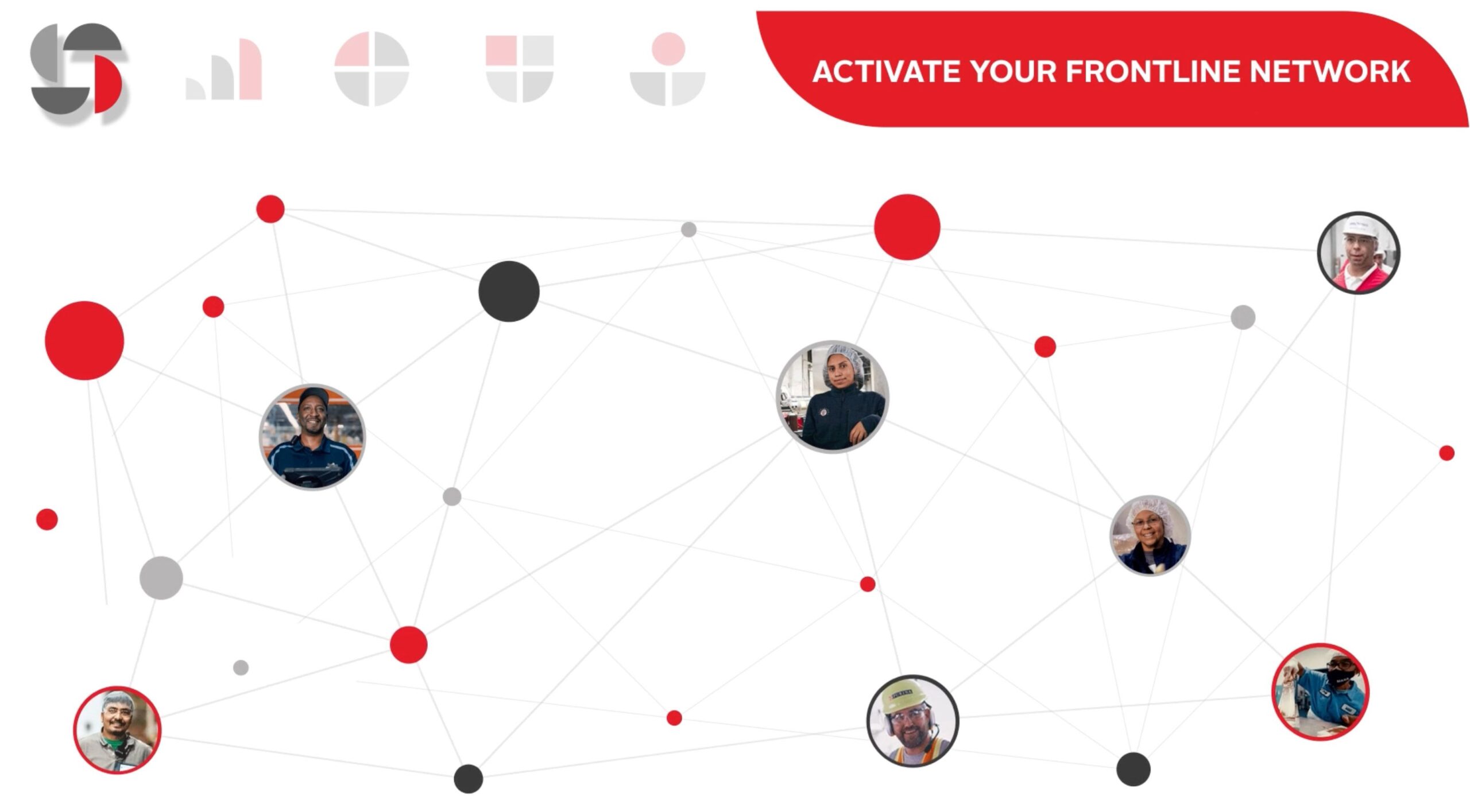
We updated their logo to reflect their emphasis on teamwork, community, and dignity, showing images of front line workers using Redzone’s tool in conjunction with the logo.

LIKE WHAT YOU SEE

Have a company that needs help?

Related Case Studies

Get in Touch