OVERVIEW


01
PROBLEM
With such a unique mission, it was difficult to properly convey their ‘why’ to new market prospects in a way that was concise.
SOLUTION
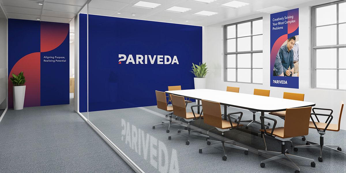
We spent time with a number of internal and external members of Pariveda to understand if this mission was the real deal and we uncovered it was. Using the new tagline ‘Aligning Purpose, Realizing Potential, we helped Pariveda connect its internal people focus with their external focus on long term client relationships.
02
PROBLEM
The management consulting space is an extremely saturated market and their former visual brand was not allowing them to stick out as much as they intended to.
SOLUTION
We developed a color palette that is reflective of the ocean, while being bold, strong and differentiating. The “P” is stylized to connote a question mark, speaking to their inquisitive, problem-solving nature and their ability to solve ambiguous challenges.
03
PROBLEM
Due to their holacratic organizational structure, Pariveda places emphasis on transparency and inclusion and wanted each cohort involved in the brand evolution journey.
SOLUTION
From beginning to end of the engagement we assisted Pariveda in keeping all cohorts involved in our process from voting on visual brand directions to targeted message training sessions that described the importance behind brand and the new way to tell Pariveda’s story.
LIKE WHAT YOU SEE