OVERVIEW

01
PROBLEM
The organization needed to differentiate itself from other commercialization partners in the space.
SOLUTION
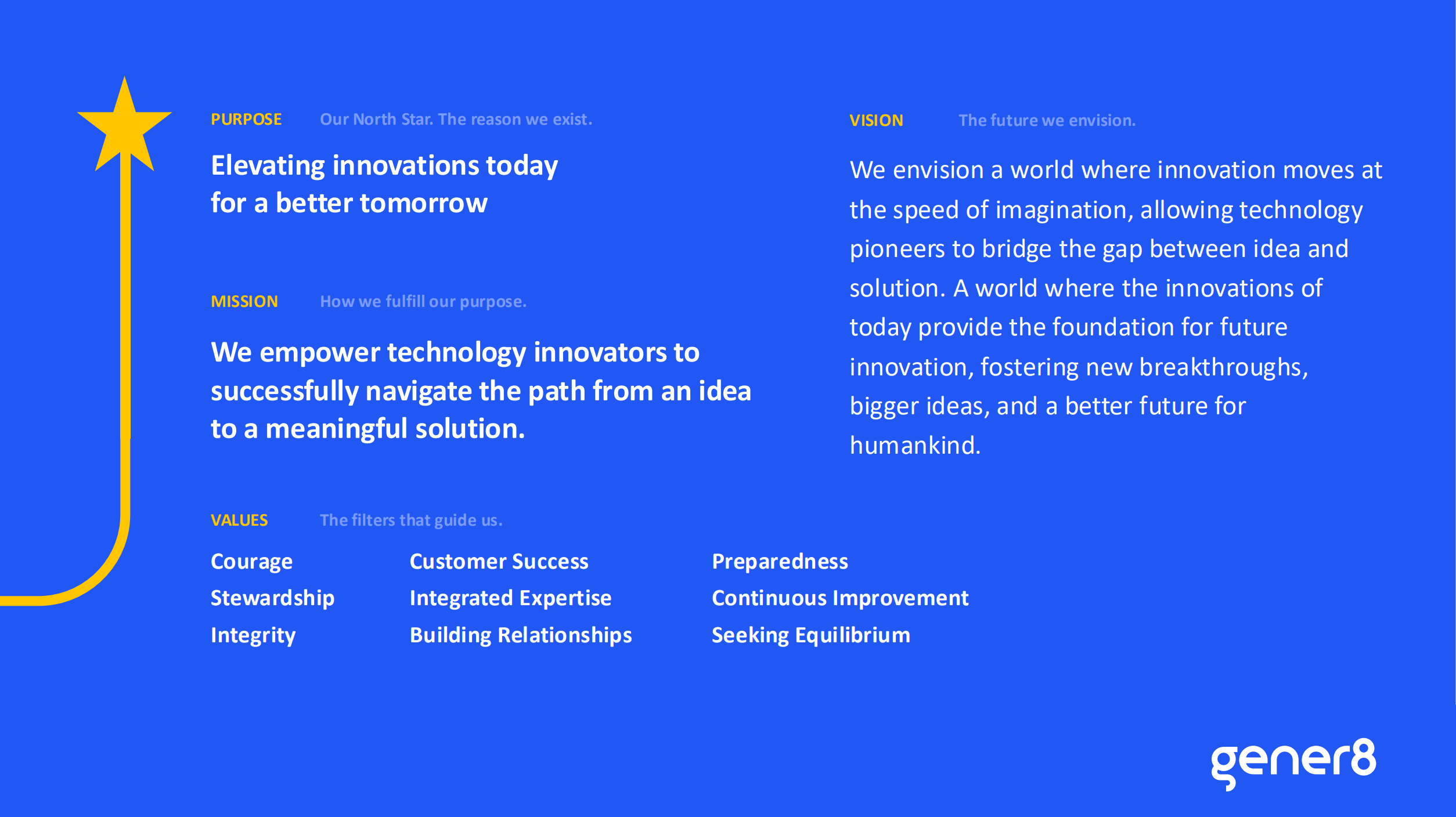
We developed a white space analysis and updated messaging that emphasized Gener8’s valued guidance, expertise, and end-to-end solutions.
02
PROBLEM
The organization struggled with describing its role in product development and innovation.
SOLUTION
Gener8’s new messaging makes the client the hero in their own journey through positioning Gener8 as the ‘guide.’
03
PROBLEM
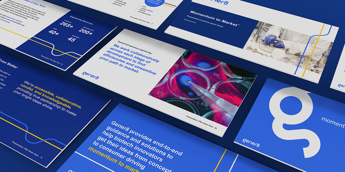
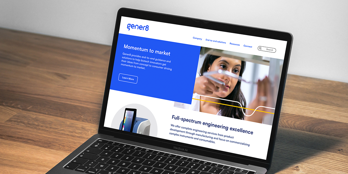
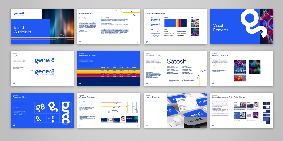
The visual brand needed an update to reflect the innovative, adventurous spirit of Gener8 and its clients.
SOLUTION
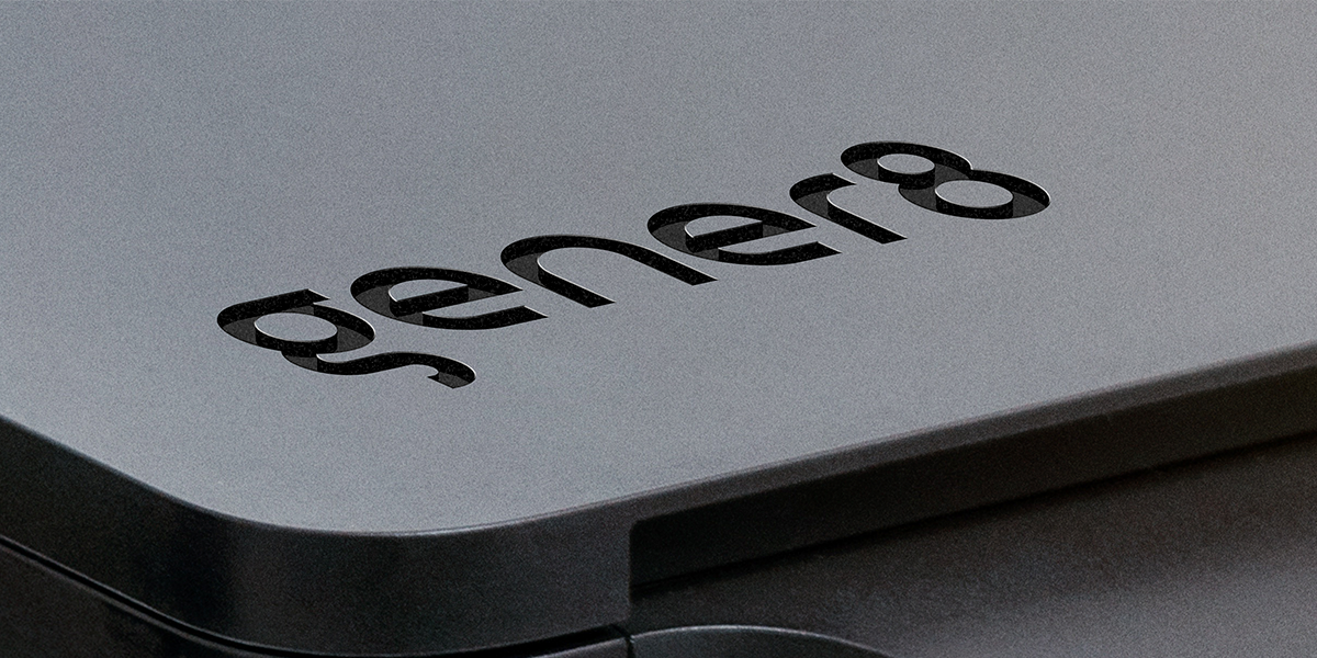
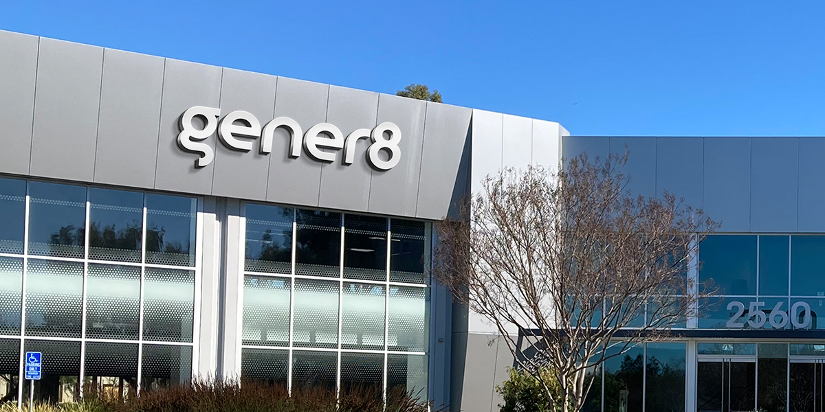
The new wordmark is clean and modern. The smooth, fluid lines allude to the seamless connection through each stage of product development that Gener8 offers its clients.
LIKE WHAT YOU SEE