OVERVIEW
01
PROBLEM
Cortado Group has a number of contracted employees that provide project-specific expertise. This has the potential to be seen as a negative from a buyer’s perspective, creating unknown variables in the buying decision.
SOLUTION
We used the messaging platform to highlight the ways in which this structure was an operational advantage for Cortado Group’s clients. Their curated network of go-to-market professionals provides clients the best of both worlds - the breadth and depth of an expert network with the accountability and ease of use with a single partner.
02
PROBLEM
Cortado Group’s visual identity did very little to communicate their area of expertise and service offerings to audiences that were unfamiliar with the brand.
SOLUTION
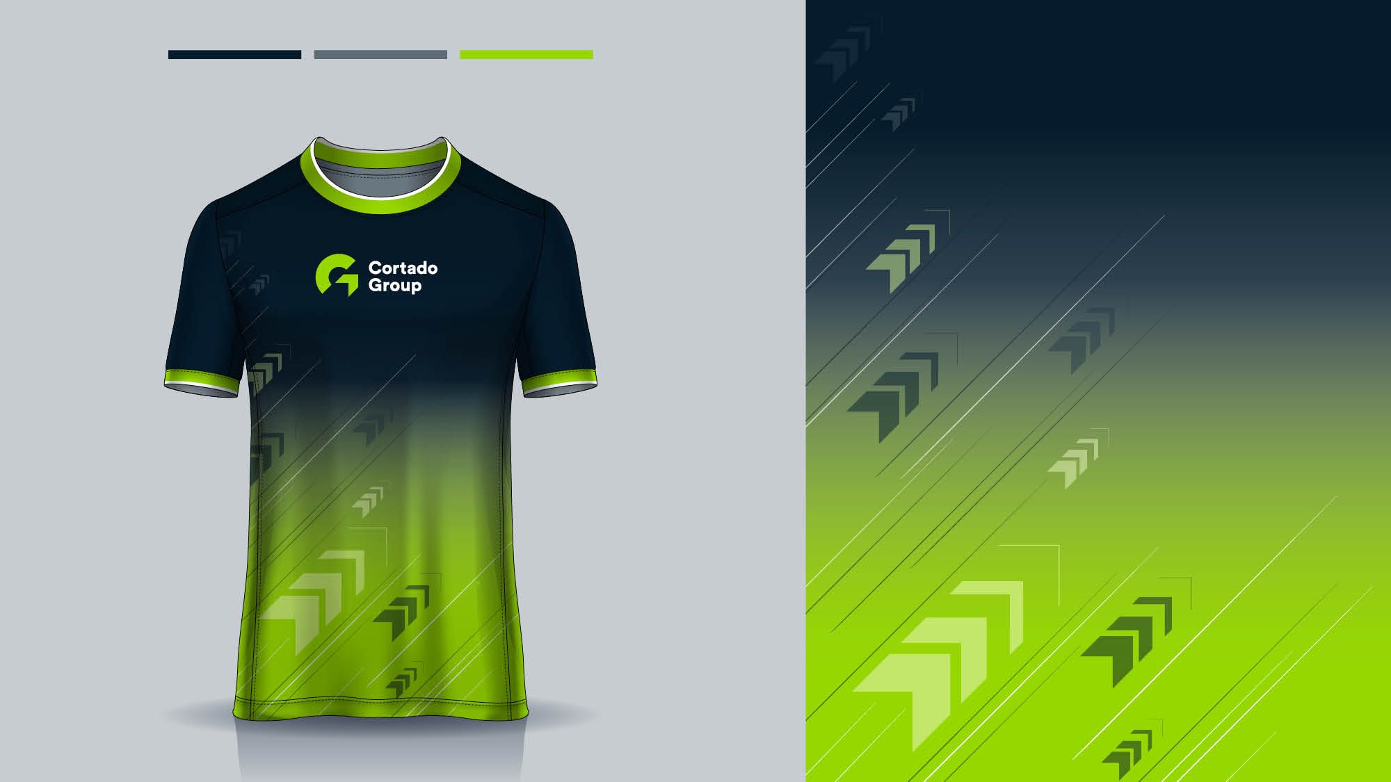
We designed a new logo for the client that elegantly highlighted their expertise in revenue growth. The logo symbol ties together the Cortado Group “C” and “G” by incorporating an arrow that moves up and to the right, a nod to positive revenue growth figures.
03
PROBLEM
The client was in the process of rebuilding its website to tell a compelling visual story and needed assistance in understanding the ways in which the visual brand could be applied to communicate effectively.
SOLUTION
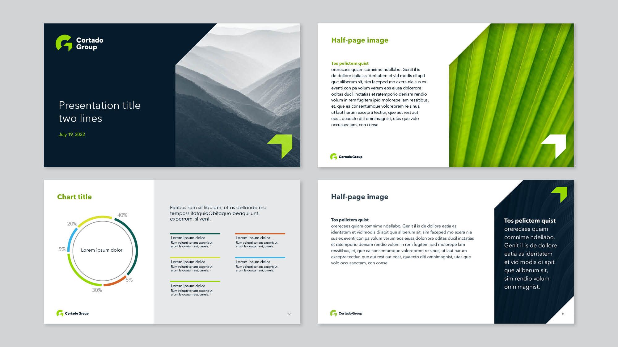
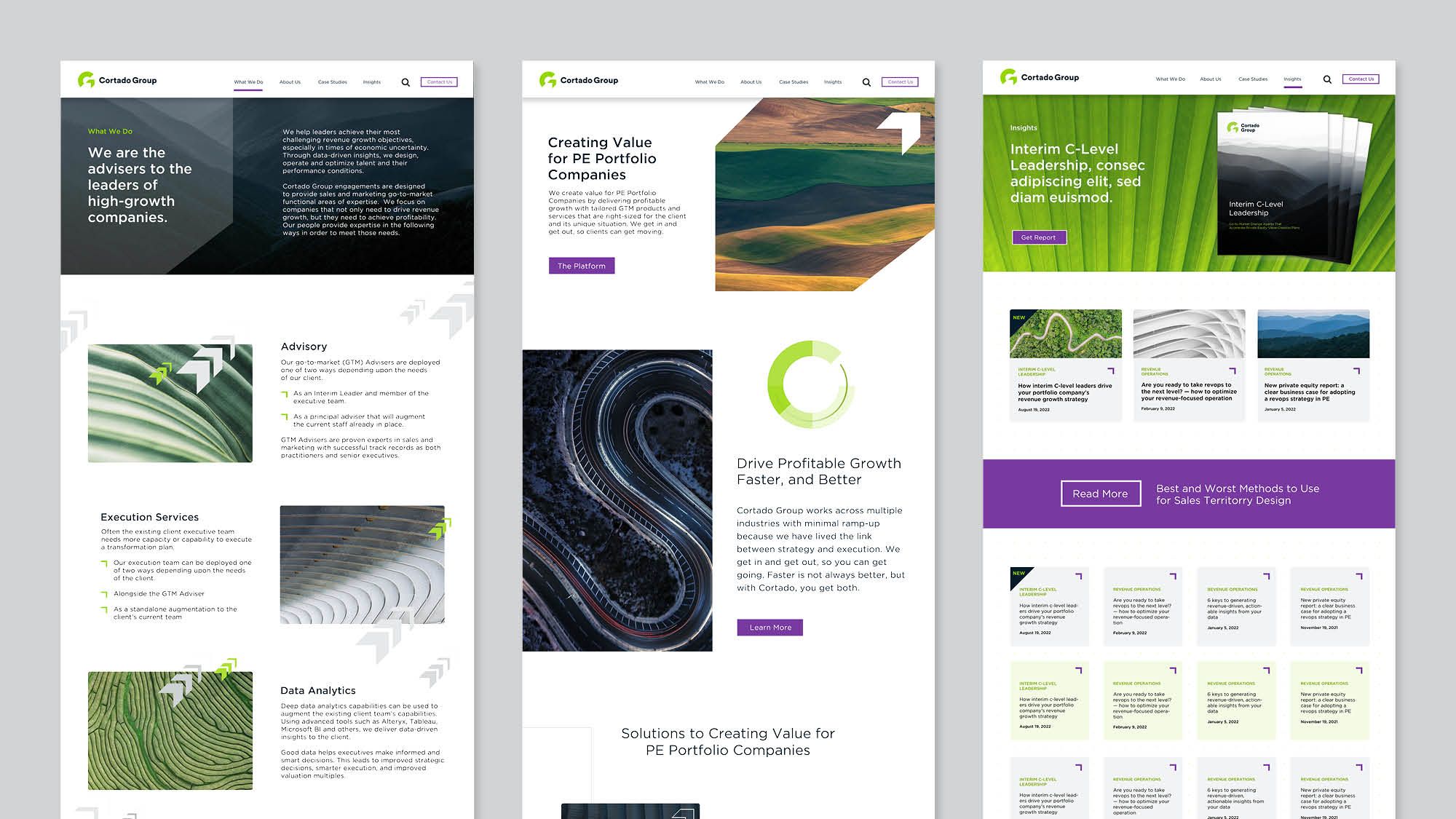
We provided the client with website design direction, showcasing the ways in which the logo symbol could be appropriately deconstructed to create graphic elements, page builds & sections, and compelling calls to action.
LIKE WHAT YOU SEE