OVERVIEW
01
PROBLEM
Clarest needed a new brand name that would speak to its future capabilities and industry focus.
SOLUTION
By combing the words “clarity” and “rest” the name Clarest appeared. The new brand name highlights their ability to leverage data-driven insights to optimize an individual’s care, allowing them to rest easy knowing they are in good hands. The name evokes the stature of a master healthcare brand.
02
PROBLEM
Clarest needed a new visual brand to highlight its new name and to differentiate itself in a crowded marketplace.
SOLUTION
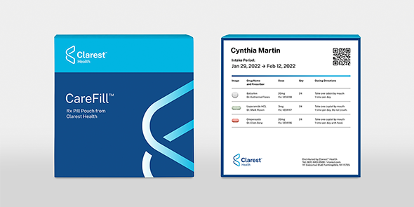
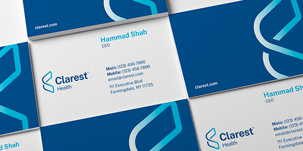
The Clarest logo is multidimensional, interconnected, and far-reaching. These attributes are similar to those that Clarest displays as a company. The use of the two-tone blue within the Clarest visual brand system was deliberate as it has a differentiated feel, while feeling very approachable.
03
PROBLEM
Clarest’s legacy brand name had a lot of brand equity and recognition, which the client was worried might disappear given the name change.
SOLUTION
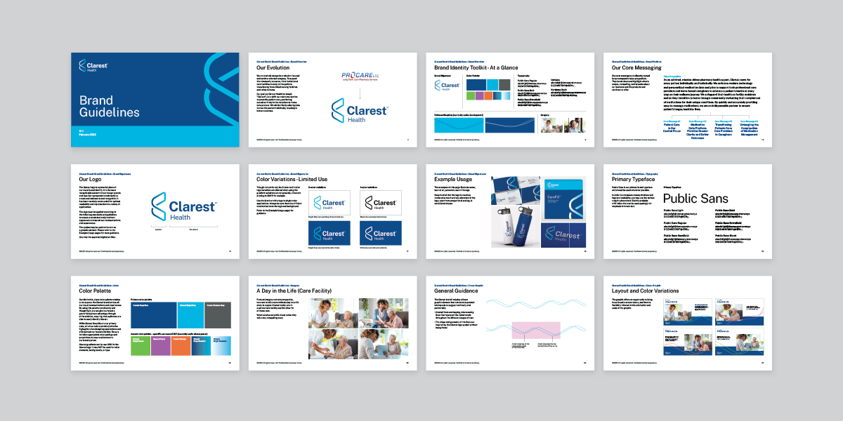
We created a tiered brand architecture transition schedule for several of the Clarest product-level offerings. This tiered transition will connect Clarest to the legacy brand, and eliminate any value loss.
LIKE WHAT YOU SEE