OVERVIEW

01
PROBLEM
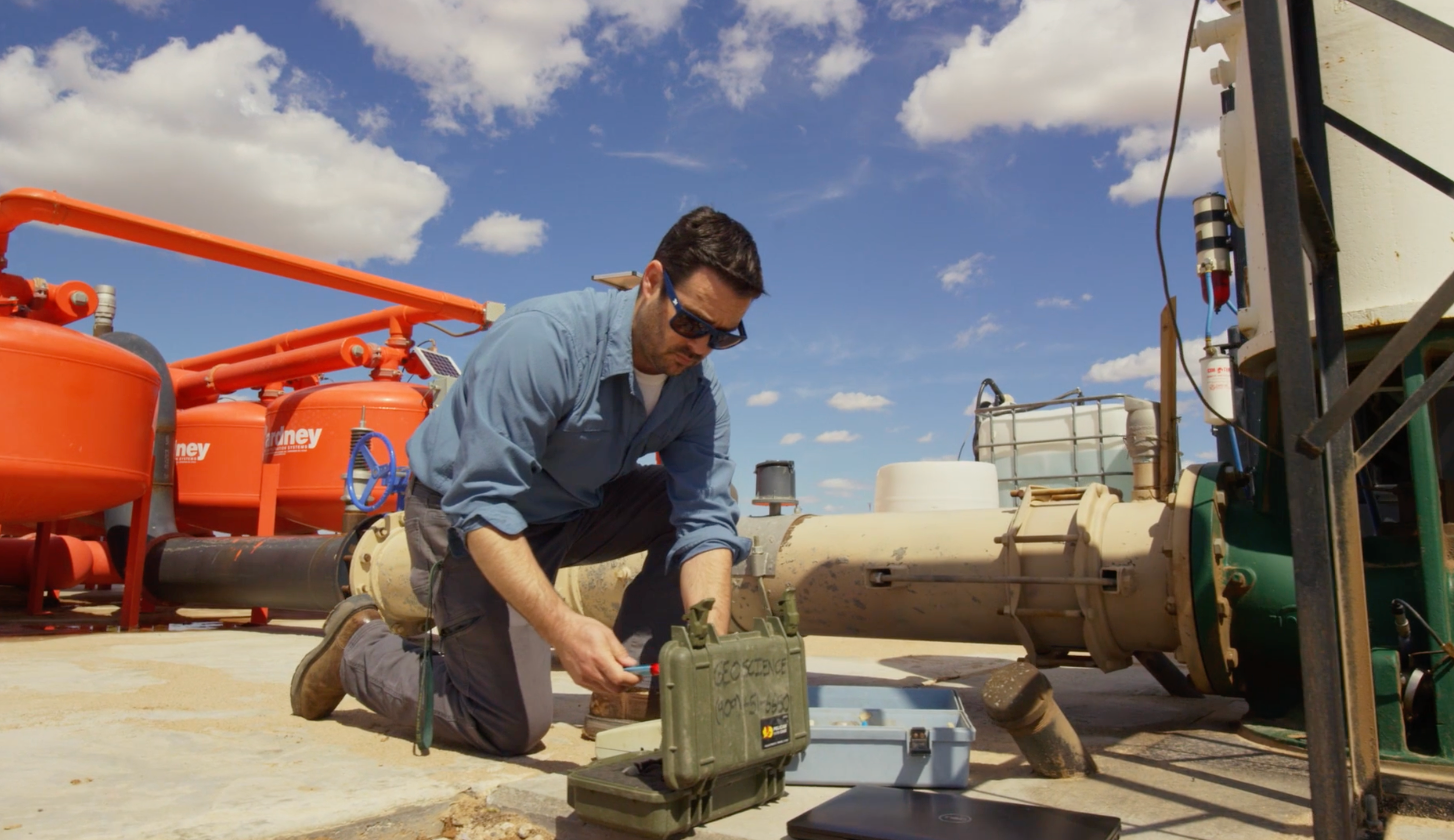
With a limiting reputation in California as a ‘water project,’ compounded with unfounded oppositional storylines that were difficult to shake, Cadiz needed to rehabilitate and redefine its reputation.
SOLUTION
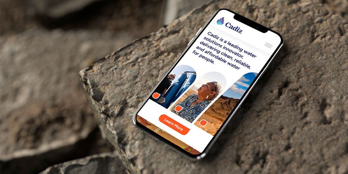
By repositioning Cadiz as a water solutions innovator rather than just a water supply project, the new brand allowed Cadiz to emerge as an innovator in a space that historically lacks innovation.
02
PROBLEM
With recent acquisitions, Board appointments, and expanded offerings, Cadiz was having difficulty consistently articulating who they were and the value they provided to their core audiences.
SOLUTION
By defining Cadiz’s purpose, vision, mission, and values, both internal and external audiences will not only know who they are but what drives them, what Cadiz stands for, their goals, and ultimately - the decision-making filters Cadiz uses to get closer to those goals.
03
PROBLEM
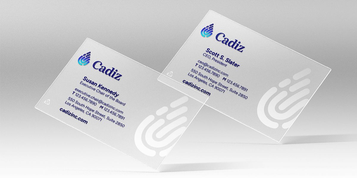
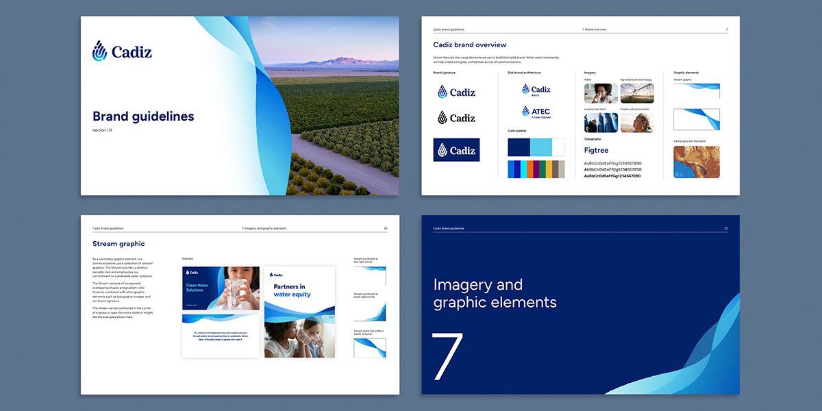
Cadiz needed a new visual identity to represent to their audiences that they are technologically advanced, modern-day innovators working to help all people have access to clean, reliable and affordable water.
SOLUTION
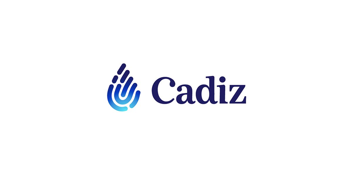
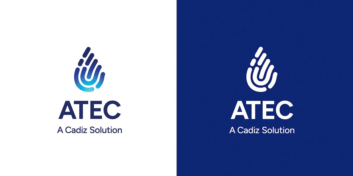
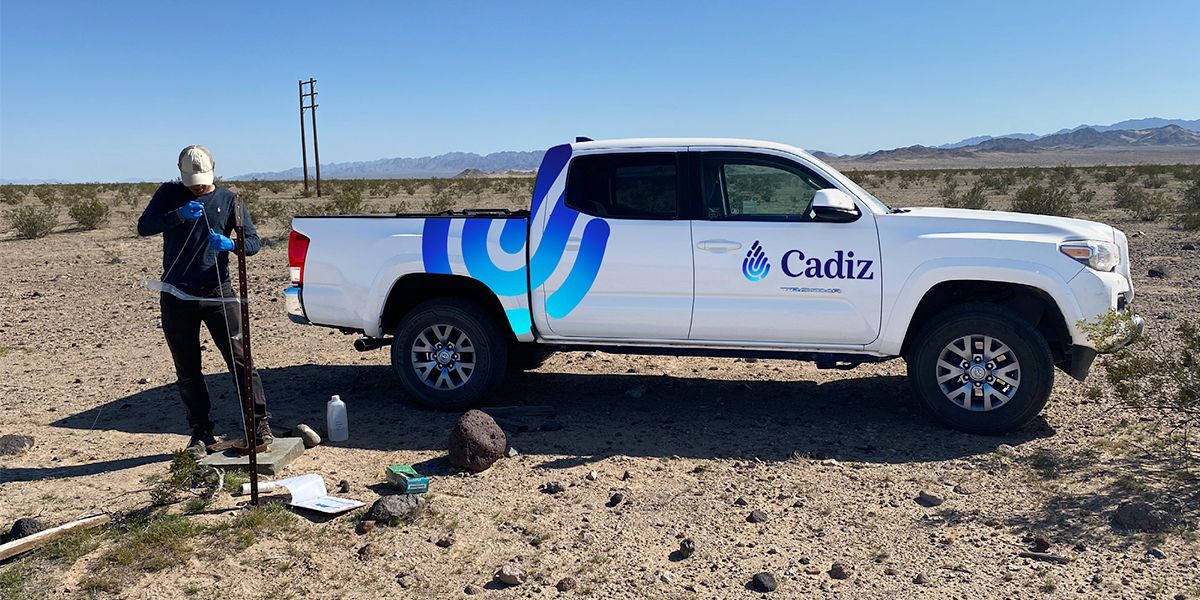
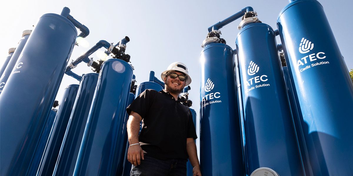
The new Cadiz logo signals change with the stylized water drop and fingerprint elements. The symbol ties back to the human need for water that Cadiz addresses. The modern rendering speaks to innovation and its curved parallel lines represent conveyance and connectivity.
LIKE WHAT YOU SEE