Sustena Group Logo
Back to Our Work

Bridgeway
Creating a compelling market-leading parent brand

Bridgeway Logo
Overview

Bridgeway is one of the country’s largest speciality transportation and logistics providers. With 20+ subsidiaries and over 500,000 loads transported annually, Bridgeway helps solve the toughest transport problems for critical industries with specialty freight needs vital to the national economy. As the company continues to evolve into a more purpose-built platform of people, transportation assets and technology, it needed a new market-leading parent brand and cohesive story to clarify and exemplify the collective value of the network of companies.

Private Equity Backed
Sector
  • Transportation and Logistics 
  • Deliverables
  • Positioning & Messaging
  • Company Name
  • Visual Brand Development
  • Brand Architecture
  • Tone of Voice
  • Targeted Message Training
  • Branded Business Tools
  • Iconography Library
  • Photo and Video Library
  • Website Development
  • Brand Videos
  • Go-to-Market Campaign Planning and Support
  • Bridgeway

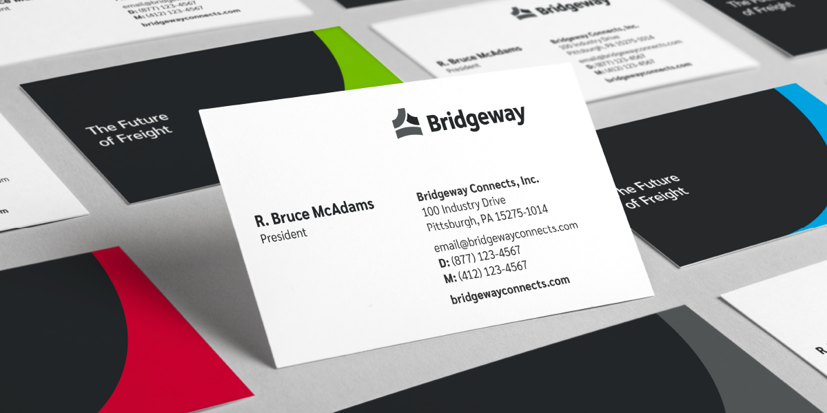
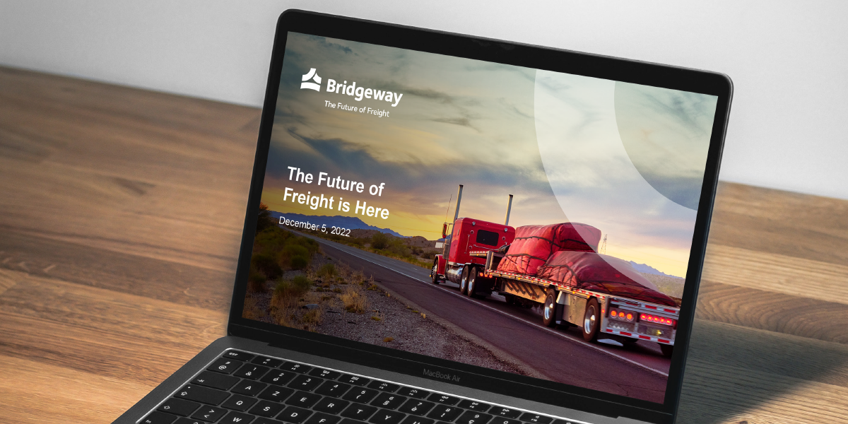
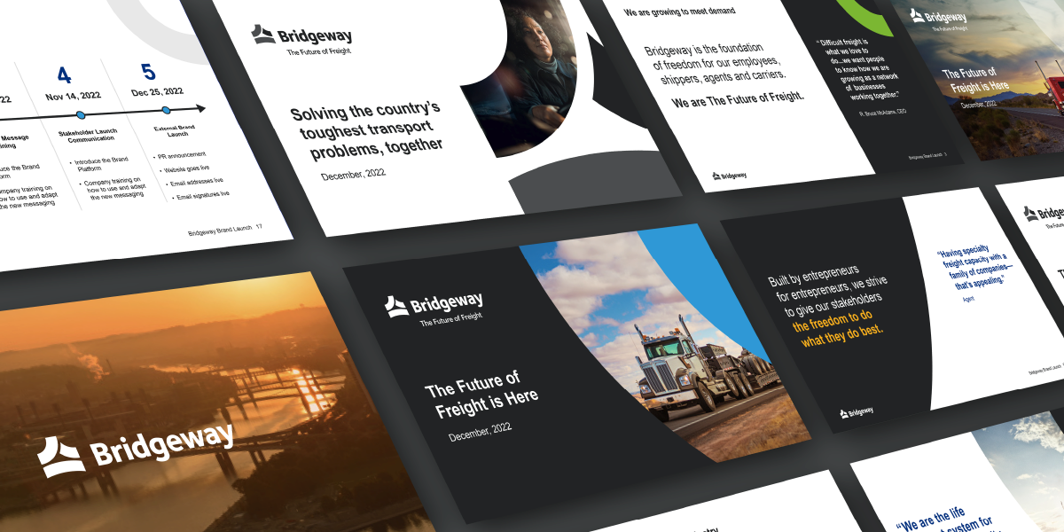
    Bridgeway's new tagline, "The Future of Freight", emphasizes the people as the backbone and future of this industry.

    Case Study Illustration
    Case Study Illustration
    Case Study Illustration
    Case Study Video Cover Image
    Case Study Illustration
    Case Study Video Cover Image
    Case Study Illustration
    Case Study Illustration
    Case Study Illustration
    01
    Problem

    The parent brand lacked awareness and a cohesive story communicating the relationship and value of the 20+ subsidiaries.

    Solution

    We renamed the company Bridgeway as an homage to the headquarters in Pittsburgh and the nature of this business. Their new message platform speaks to their foundation – entrepreneurs, problem solvers, professionals – giving their companies and stakeholders a unified, powerful story to rally behind.

    02
    Problem

    Their visual brand was outdated and did not represent the size and scale of this modern-day industry leader.

    Solution

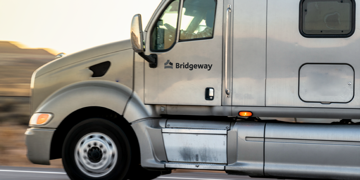
    This new visual brand is clean, simple, and modern. The three parts of the symbol represent the three primary stakeholder groups – agents, owner-operators, and shippers. A scalable visual brand system was developed for the subsidiaries to take on the look and feel of the parent brand as part of the overall strategy to further tie the story together.

    03
    Problem

    The company was undergoing significant expansion in organic growth and needed a way to continually reconcile and rationalize new companies, offerings and brands under a single, unified brand and value proposition.

    Solution

    In addition to a single company story, we delivered a model for how to organize and express new brands in terms of their value to the end customers and external stakeholders, so that as the company grew, the brand could go grow with it.

    Like what you see
    Have a company that needs help?
    Get In Touch

    Related Case Studies