Companies choose brand visuals—like their logo and colors—to identify who they are and what they offer. But those visual choices are more than just arbitrary. Whether companies realize it or not, visual design sends signals to the market about their vision, values, and what they stand for, which affects how they are perceived by audiences.
By Ryan Paul, Principal and Creative Director
Besides a company’s actions, its visual brand also affects how it is perceived. Messages companies send are either supported or undermined by their visual brand. The way a company physically “looks” has a significant impact on the way the market views its brand. Brands that get it right enhance and strengthen their message, while those that get it wrong erode their message and risk damaging the brand.
Effective brands should be Credible, Relevant, Understandable, and Distinctive, collectively known in the industry as the CRUD framework. The four criteria are essential to connect with audiences. Brands must combine the right messages—the words—with visuals that support and elevate those messages.
- Credible: Audiences need to believe that the brand can deliver what it says. Visuals that don’t support the message will undermine credibility.
- Relevant: Brands must convey that they are relevant to customer needs. Visuals need to be aligned with the message to communicate value.
- Understandable: Customers won’t buy what they can’t understand. Visuals that send confusing or mixed messages work against the brand.
- Distinctive: If customers can’t tell the difference between you and a competitor, why would they choose your brand over theirs? Distinctiveness and differentiation set brands apart.
A thoughtful approach to your visual brand will do much of the heavy lifting necessary to address these challenges and send the right brand messages.
Visual Brand Elements: What They Say About a Company
Logo
A logo is arguably the most valuable tool companies use to identify their product, service, or offering. Most company logos consist of a wordmark, a graphic symbol, or combination of both.
Wordmarks
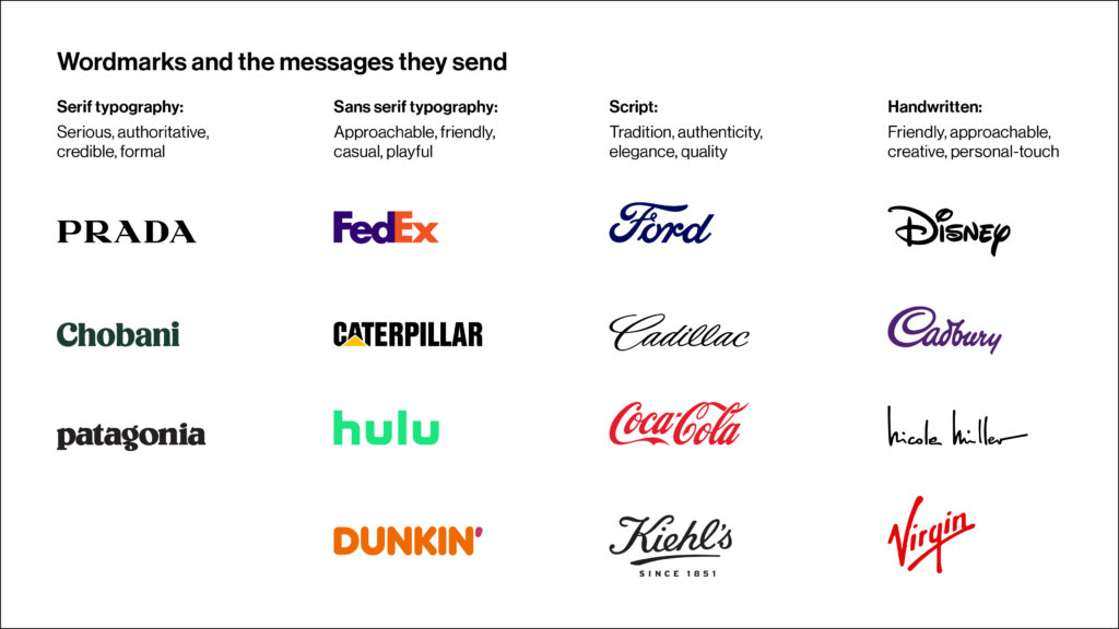
A wordmark is a text-only rendering of a brand name, without an accompanying symbol or graphic. Wordmarks can be straightforward or stylized and, depending on their execution, telegraph distinct characteristics or personality traits. Here are some examples.
- Serif: Serif wordmarks have small strokes at the ends of their letters and convey a message that is serious, authoritative, credible, and formal.
- Sans serif: Sans serif wordmarks omit strokes at the ends of their letters and appear approachable, friendly, casual, and playful.
- Script: Script wordmarks look like calligraphy and suggest tradition, authenticity, elegance, and craftsmanship.
- Handwritten: Handwritten wordmarks are a subset of script and suggest a brand is friendly, approachable, and creative. Handwritten wordmarks add a personalized touch.
Typography and associated messages are discussed in more detail later in this article.
Symbols
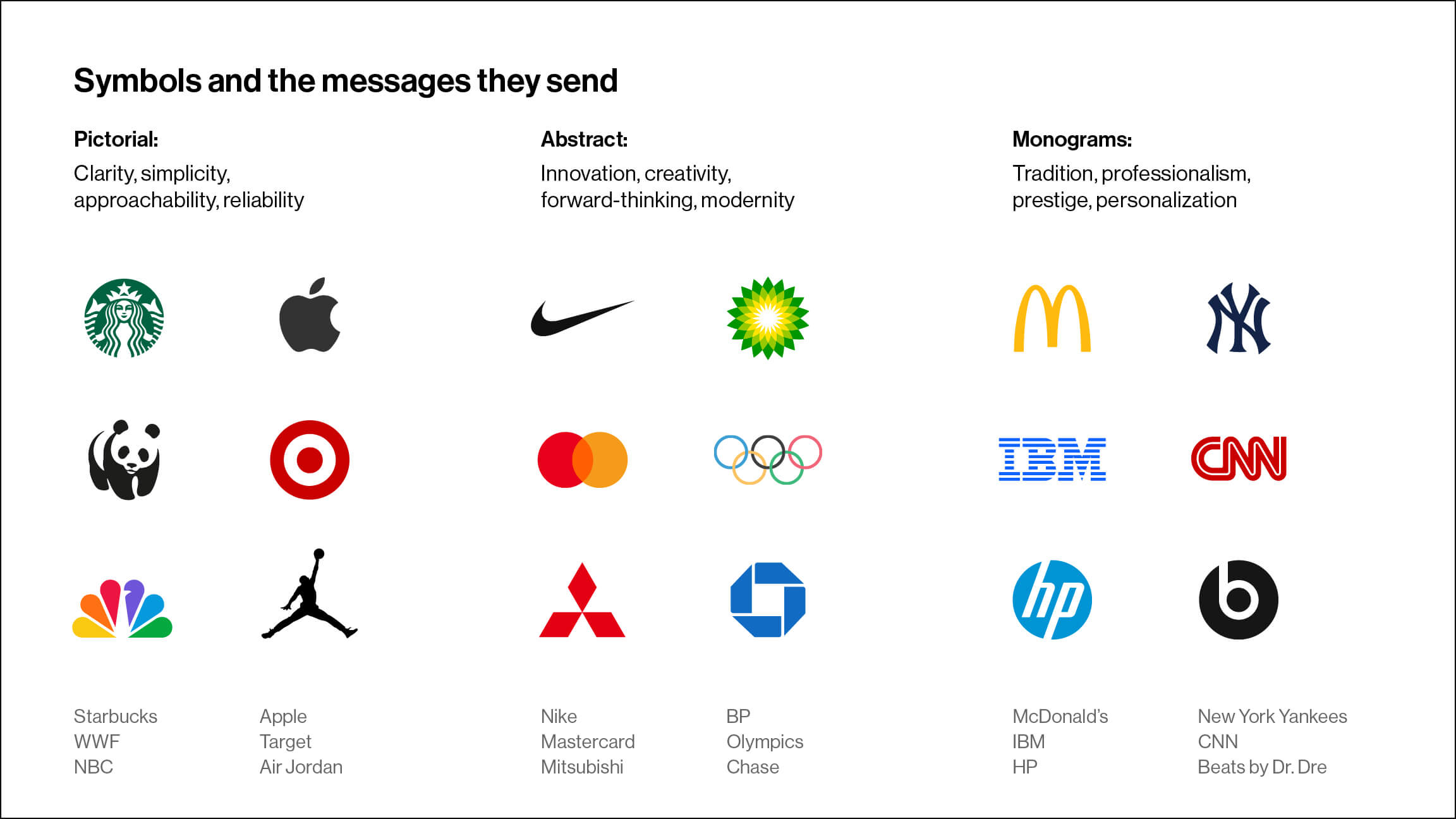
Symbols are visual marks that communicate without words, in a simple and powerful way. They can be classified into a few distinct categories, shown here.
- Pictorial: Pictorial symbols use recognizable images or icons to represent a brand. They are immediately identifiable, familiar, and easy to remember. These symbols send messages of clarity, simplicity, approachability, and reliability.
- Abstract: Abstract symbols are not literal depictions, commonly evoke intangible feelings, and are open to interpretation. They represent concepts rather than objects, signaling a fresh perspective or new idea. Abstract symbols suggest innovation, creativity, forward-thinking, and modernity.
- Monogram: Monograms are made from the initials of an organization’s name, often designed in a stylized way. They are timeless symbols that reflect a sense of pride, history, legacy, and individuality. Monograms represent tradition, professionalism, prestige, and a personalized touch.
Combination logos
Wordmarks and symbols often appear together to form a combination logo, also called a “logo lockup.” This combination of elements sends multiple messages at once.
Color
Color is a powerful tool that triggers emotion and affects how messages are perceived. People associate color with personal experiences, cultural influences, and psychological responses—evoking strong reactions.
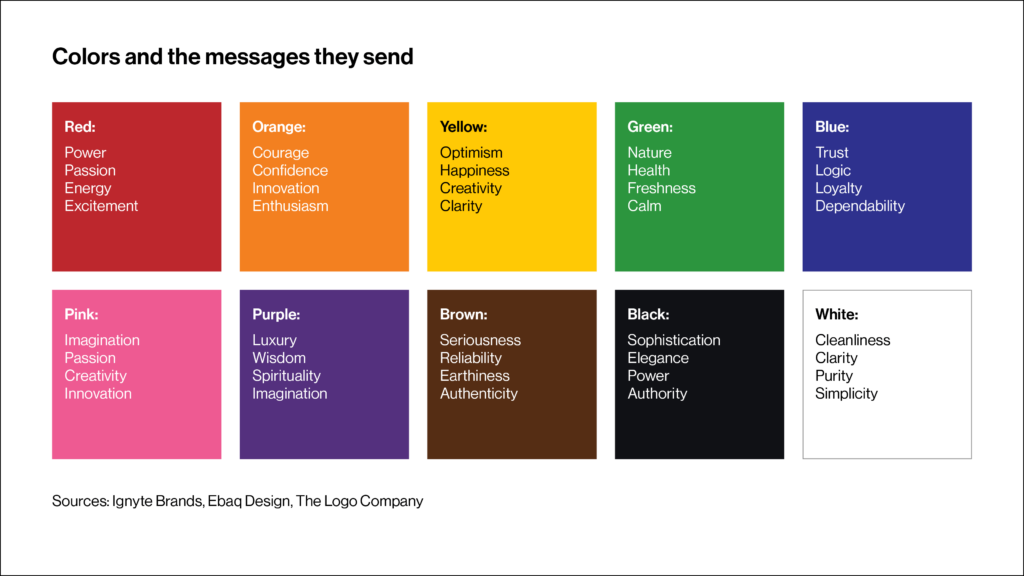
These are the most common emotions and meanings associated with popular brand colors:
- Red: power, passion, energy, excitement
- Orange: courage, confidence, innovation, enthusiasm
- Yellow: optimism, happiness, creativity, clarity
- Green: nature, health, freshness, calm
- Blue: trust, logic, loyalty, dependability
- Pink: imagination, passion, creativity, innovation
- Purple: luxury, wisdom, spirituality, imagination
- Brown: seriousness, reliability, earthiness, authenticity
- Black: sophistication, elegance, power, authority
- White: cleanliness, clarity, purity, simplicity
Colors aren’t limited to a company’s logo; they appear everywhere: on websites, marketing collateral, advertising, events and trade shows, packaging, vehicles, and promotional items. Color affects the entire brand, so a focused, deliberate color palette is critical to send the intended brand message.
Typography
Typography—the typefaces we use to format headlines and text—sends strong signals that affect the tone of all our messages.
Typefaces come in many styles, but most businesses use typography that can be classified into two categories: serif and sans serif. Serif typefaces have small strokes at the ends, called serifs, and sans serifs omit them (hence the word “sans,” which means “without”).
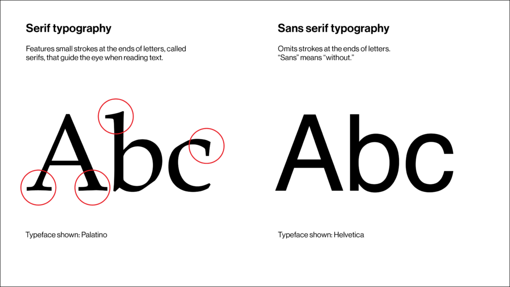
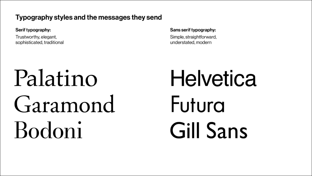
Serif and sans serif type convey different messages:
- Serif typefaces: Serif type sends a traditional, sophisticated, or formal message, conveying characteristics associated with professionalism, history, and authority.
- Sans serif typefaces: Sans serif type sends a relaxed, approachable, or informal message, conveying characteristics associated with friendliness, simplicity, and modernism.
Capitalization style will also affect messages. All-caps type signals strength, authority, formality, and seriousness, and lower-case signals friendliness, approachability, casualness, or a relaxed tone.
Imagery
Imagery enhances messages by providing context, enabling audiences to see and feel a brand without reading any words. Images help audiences identify with the story, connect with its subject, and experience the brand on an emotional level. It’s common for brands to use color photos, black and white photos, or illustrations. Each of these styles says something different.
- Color photos: Color photos feel contemporary and true-to-life, like the scene is unfolding before our eyes. Color images send messages that portray realism, vibrancy, energy, and detail.
- Black and white photos: Black and white photos remove the distractions of color, emphasizing artistic expression and form. They send messages that portray sophistication, professionalism, luxury, or a serious tone.
- Illustrations: Illustrations can be simple or highly detailed and offer flexibility in storytelling and interpretation. Illustrations express creativity, individuality, playfulness, and a relaxed tone.

Some companies use a combination of these styles to tailor messages to different audiences.
Send the Right Message for Your Brand
How can you determine whether your company’s visual brand is sending the right message? Evaluate your visual brand by answering the following questions:
- What is your vision for the brand? Do you want to be viewed as traditional or modern? Professional or casual? Established or innovative?
- What messages do you want to send? Which characteristics will reassure audiences and help them feel confident in your offering? Which traits will they find most relevant?
- Consider your logo, website, and marketing materials. Are the visual elements consistent with the message you’re trying to send? Do they support or undermine your intended message? What does the visual brand do well? What could be improved?
- Are there inconsistencies in your visual brand that send contradictory signals? Will audiences find those contradictions confusing?
Once you’ve answered these questions, you’ll be well-positioned to develop an intentional, focused visual brand that sends a message tailored for your audience.


